Summary
Get an at-a-glance view of the stages, key events, critical path, and cost of the program. Use the Display button at the top right to adjust the time intervals and choose what fields to show/hide.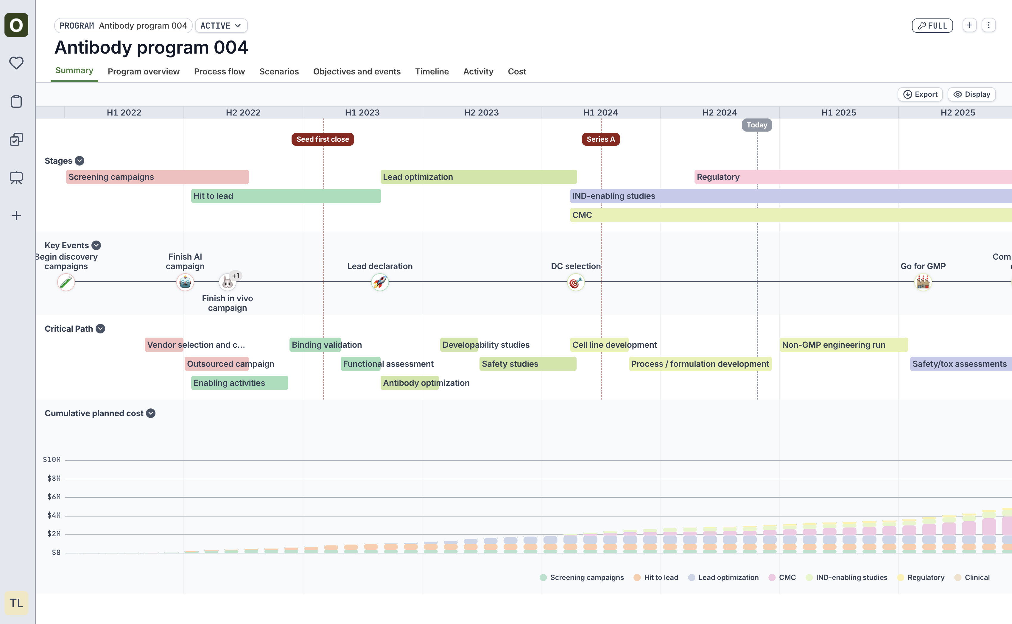
Process flow
View a map of the dependencies within the program. Use the Display button to show/hide fields and to show/hide Critical Path (i.e., path of longest duration)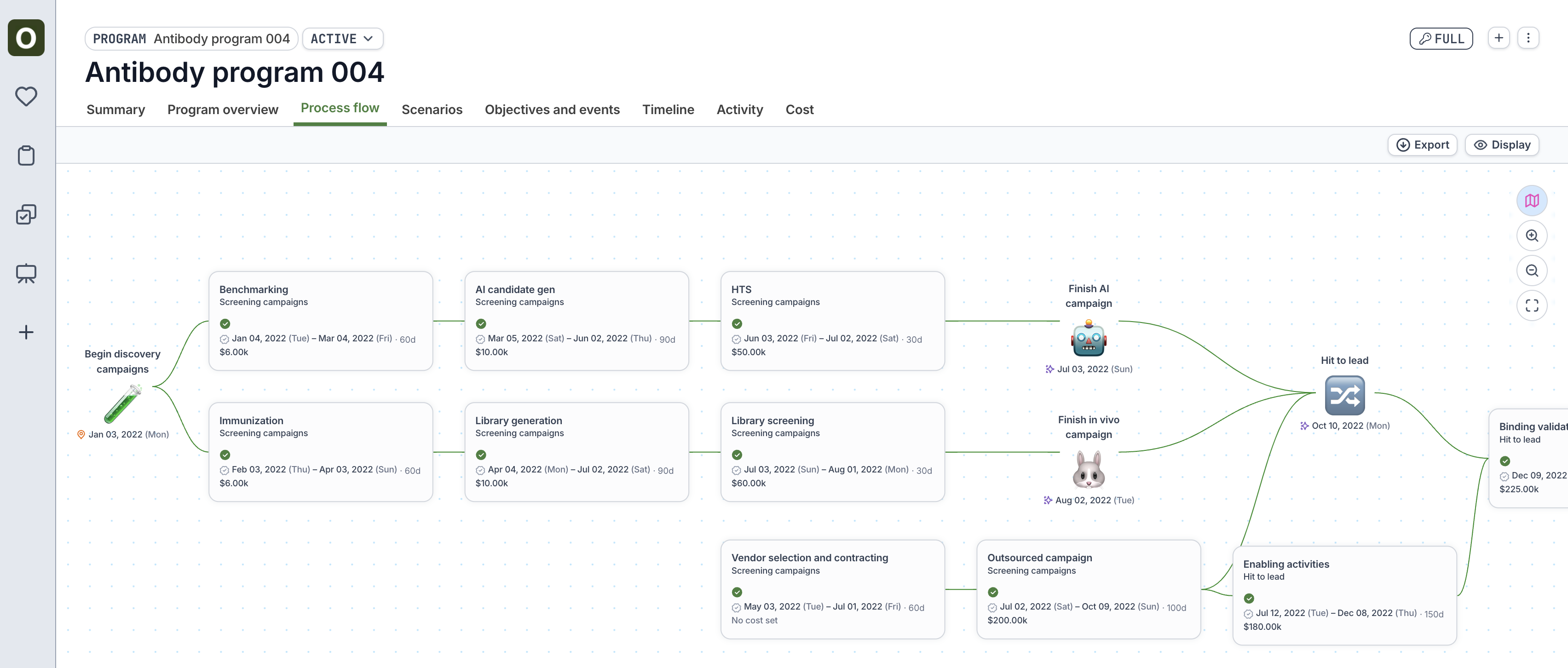
Scenarios
If scenarios have been added to the program (see Scenarios), view the side-by-side comparison of when the stages and key events will fall in the scenarios vs. active.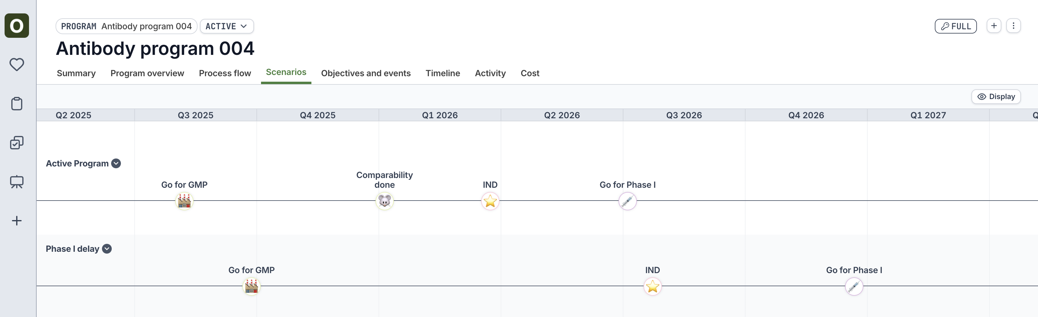
Timeline
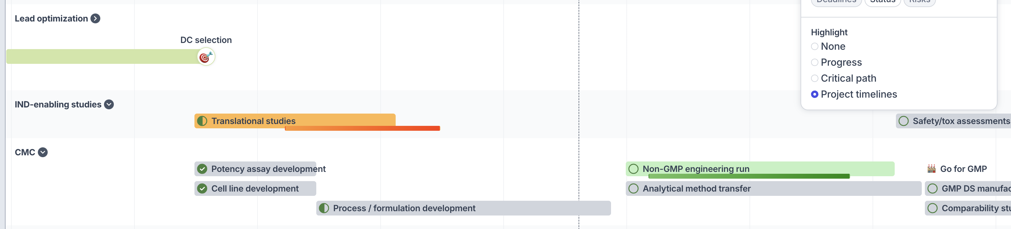
View a Gantt-like chart of the objectives and key events within the program. Use the Display button on the top right to customize the view:- Group by: Group the swimlanes of the timeline either by stage or by tag
- Interval: Adjust the timescale of the timeline
- Density: View the timeline bars as condensed vs. stacked
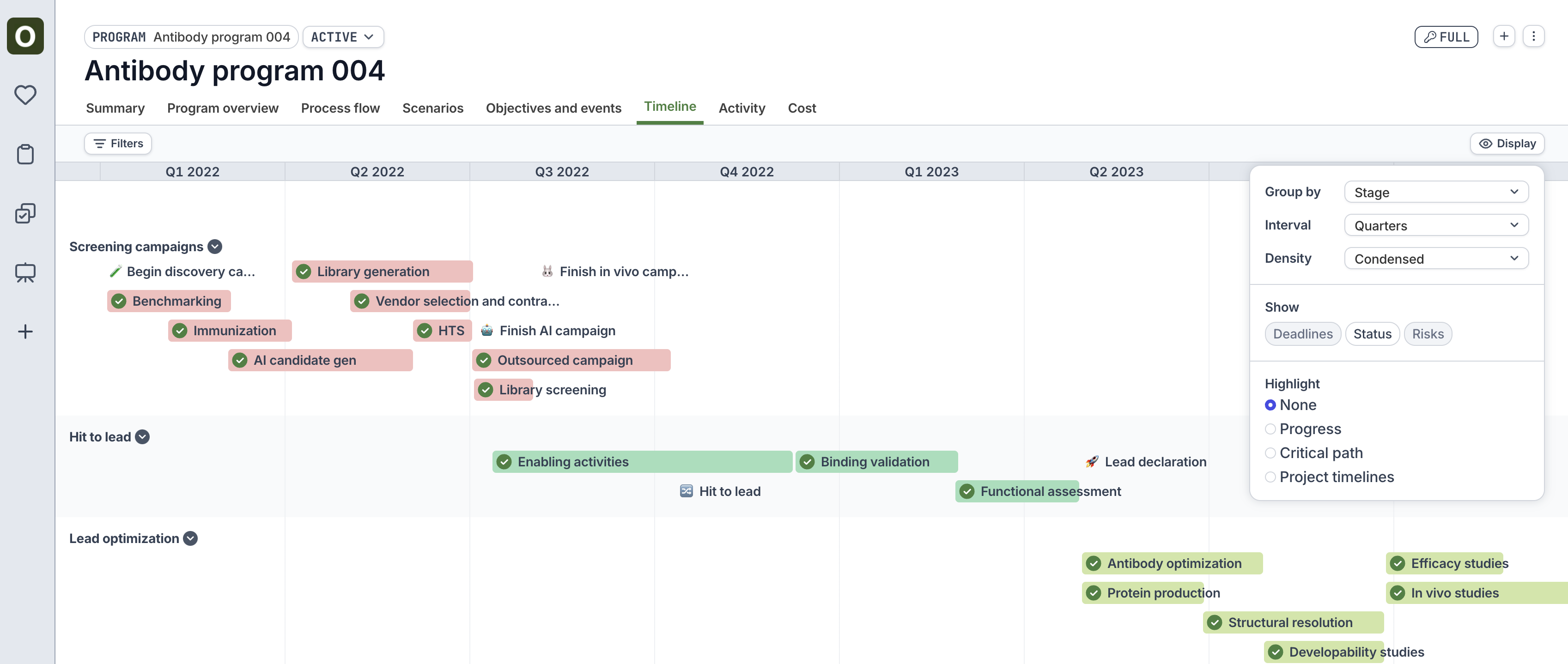
- Progress: Shows the completion % of the project tasks within an Objective
- Critical path: Highlights the critical path in red (i.e., path of longest duration)
- Project timelines: Displays the project timelines for a project within an Objective
- Green projects indicate the the project dates are within the planned objective dates
- Orange projects indicate that the project is overrunning the planned dates.